A bit of history… Established in 1974 as Women Against Rape (WAR), our organization began as a grassroots movement dedicated to assisting survivors of sexual assault. Over these five decades, we have strived to remain responsive to the current needs of the community and survivors of sexual assault, which has led us to continually evolve our identity and messaging.
In the year 2000, Verity underwent a significant transformation, recognizing the importance of inclusivity in our mission. We transitioned to the name United Against Sexual Assault (UASA), reflecting our dedication to serving all survivors, regardless of gender identity or background, and demonstrating that we are “united” in the fight to end sexual assault.
In 2010, we embarked on our third transformation, transitioning from UASA to Verity. The name Verity originates from the Latin word “veritas,” meaning “truth.” This name encapsulates our commitment to providing survivors of sexual assault with a safe space to express their experiences, while also being held in confidentiality. Our mission is to empower survivors to take the necessary steps in their healing journey, knowing that they are supported and respected every step of the way.
Now, in response to the evolving needs of our movement, we are excited to unveil our latest rebranding initiative.
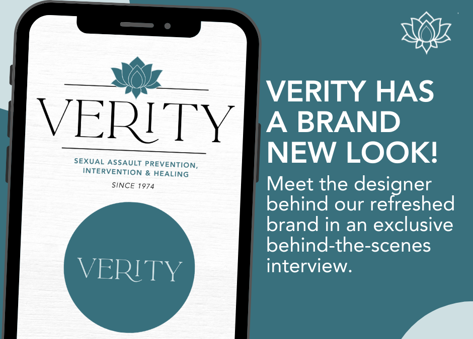
As part of this process, we have collaborated with Corrin Messing, a local graphic designer and longtime supporter of Verity. Corrin has crafted a new logo that encapsulates our values and vision for the future. We had the opportunity to speak with Corrin about her involvement in the project:
Q: What inspired you to become a graphic designer, and how did you get started in the field?
A: I was always an artistic kid, drawing all the time and making scrapbooks with photos and collage items. I had a High School teacher notice some of my collages and hand lettering and she introduced me to what Graphic Design was and helped get me started playing around on some computer drawing programs. I enrolled in an art college and loved it, graduating with a Bachelor in Fine Arts degree in Graphic Design.
Q: Can you tell us about your creative process when designing Verity’s logo?
A: I always start with researching the brand I am about to design a logo for and lucky for me I have worked and volunteered with Verity for several years now, so I had a deeper sense of the organization than I usually do going into a project. I like to spend time searching through magazines and the internet to gather visual inspiration through color, shapes, patterns and different typography styles. I then do many quick computer sketches for different logo design ideas and pair it down to the best 4-6 designs that I will fine tune a little more before sending to the client. I like to work in black and white first because a logo always has to shine when simplified and then I like to play with color toward the end of the final logo design.
Q: What elements did you incorporate into the logo design, and what significance do they hold?
A: Because this was a redesign, we wanted to pay homage to the existing colors Verity is known for, but elevate them a little and make it feel fresh. The lotus flower illustration was chosen specifically because of its meaning and symbol of strength, resilience, and rebirth, the very core elements that Verity represents.
Q: Can you share your thoughts on the importance of representation and inclusivity in design, especially within the context of Women’s History Month?
A: It is so important to have more women represented in the design field at a high level and it has definitely begun changing since when my career first started over 15 years ago and all of the head designers I worked with were all males. To have design that speaks directly to women, for women and created by women, is extremely empowering for younger generations to see they have a place at the table and to set the precedent that being a woman is needed and important.
Q: How do you hope Verity’s new logo will resonate with its audience, particularly surivors of sexual assault who are primarily women?
A: I hope that this logo feels safe and strong and is recognized for its timeless simple beauty which is approachable to all, especially to women who may be in crisis or in need of support and comfort from our amazing staff.
As we honor Women’s History Month and pay tribute to the remarkable women who have shaped our world, we invite you to join us in embracing this exciting new chapter for Verity Sonoma County. We stand in solidarity with survivors, to amplify their voices and advocate for change.
Recent Comments